Mobile First Website Design
Why Mobile First?
Mobile First is the newest approach to website design
fundamentals. It means exactly what it says, the emphasis of the design
and website build standards are based on placing the user experience of
the mobile user as the highest priority.
The online world is well beyond "going digital". It has gotten
personal, and few things are more personal than our attachments to our
mobile phones. How often do you wander more than 10 ft from your phone
and don't you feel 'naked' without it? Pants pockets with space for my
phone are as important as size, fit and colour. The online evidence to
suggest mobile matters most is becoming increasingly clear. In 2016 we
passed the tipping point in North America where web browsing activity,
searching, viewing, watching, buying, playing is now more than 50%
happening on mobile phones as compared to desktops (laptops and desk top
computers). In SK, where the landline infrastructure is extremely high
quality, the numbers are still skewed a bit towards desktop. In a very
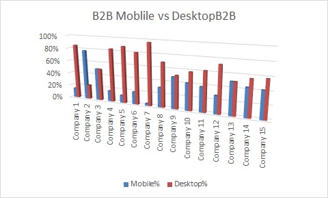
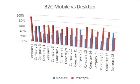
recent examination of Saskatchewan based websites, the data over the
first 75 days of 2017 suggests that for both B2C and B2B websites, 41%
of user sessions are mobile and 59% are desktop (including tablet).
However, compare this to some similar analysis from 2 years ago where
the split was roughly 25% to 75% and you can see that the future is
clear, and the future is mobile. See this article for more detail on
this mobile vs desktop comparison.
Mobile First website design means prioritizing design decisions for the device most users will be viewing your website on, their phones.
- NMI


How Does Mobile First Affect Website Design?
The obvious answer is in almost every way and then some more. As
dial-up modems died off and high speed internet bandwidth became more
ubiquitous, we as website developers had the luxury of being both
bloated and inefficient. Big shiny graphics, transitions, slide shows,
and (gasp) Flash was at the forefront of design. Big bandwidth plus big
screens meant we could load our pages with all varieties of visual
effects and all manner of graphics. The thought of efficient coding to
conserve file load times and optimized images were tossed out the window
in favour of more, more, and more. Now it all matters because today's
most prolific group of web searches and information about your business
seekers are on their phone, where screen size and often bandwidth are at
a premium.
What Does Google Think About Mobile First?
This has already happened. For most websites their Google search rankings
results are be based on the mobile search experience. Yes, Google has
different search bots that view your site through different lens (Google
and the search industry call them algorithms) and produce different
search results. The mobile search algorithm places more emphasis on
things like page speed (including image size) and ease of navigation.
Consistent with both both search lenses however is that content is still
the major ranking factor (don't lose sight on the value of content).
Apps vs Websites
The obvious answer is in almost every way and then some more. As
dial-up modems died off and high speed internet bandwidth became more
ubiquitous, we as website developers had the luxury of being both
bloated and inefficient. Big shiny graphics, transitions, slide shows,
and (gasp) Flash was at the forefront of design. Big bandwidth plus big
screens meant we could load our pages with all varieties of visual
effects and all manner of graphics. The thought of efficient coding to
conserve file load times and optimized images were tossed out the window
in favour of more, more, and more. Now it all matters because today's
most prolific group of web searches and information about your business
seekers are on their phone, where screen size and often bandwidth are at
a premium.
What is a Tablet, Desktop or Mobile?
When we do our own analysis of user behaviour by device type, we tend to
think of tablets as merely extensions of the desktop, a convenient way
yo bring your larger screen experience from the desk to the coffee table
or the counter top. While there is certainly a portion of tablet use
that is truly mobile, especially tablets which are Bluetooth connected
to mobile phones for data use, more tablet use is in-home and more a
matter of convenient form factor as opposed to out and about usage. So
when we compare mobile to desktop, we typically include the roughly 7%
to 10% of searching and browsing on tablets as desktop.
Responsive Design
There are several key characteristics to consider with respect to design criteria when taking a Mobile First approach.
Screen Size:
The practice of coding websites so that they adjust, adapt, respond to the device used to view them is still as relevant as when Responsive Design became "The Thing" earlier this decade. Now it just starts at the other end. Previously the approach was to adapt as the screen size shrank to the lowest common denominator, the mobile phone screen. Now the lowest common denominator is actually the most common screen size. The design process is now flipped on it's head, begin at the phone (Mobile First) and scale up to the desktop monitor size.
Speed:
It's a fact of technology, the handheld devices, as amazing as
they are, do not often have the same computing power and processing
speed of a laptop/desktop. Plus, when data speeds go wireless, they are
typically slower, whether that is over a cell network direct to the
phone or in-home / in-office WiFi. So the challenge is to do less code,
to use image sizes wisely, and to think through the experience when the screen is in our hands, not on the top of our desk.
Navigation:
Navigation: Less clicks to get from home page to desired content is even
more important. A relative comparison. The pointer of a mouse on a
screen will typically occupy 20 to 30 pixels of the 750,000 plus pixels
on the screen. That's many times less than 1% if you want to do the
math. A finger on a phone screen, on the other hand, can occupy
anywhere from 2% to 5% of the screen so navigation must be both compact
and expandable. There is no room for a large header menu and in order
to avoid incorrect navigation choices there needs to be adequate
separation of navigation elements. Two factors that are not commonly an
issue on a large screen display but two factors that can drastically
affect the user experience of the mobile user. Also regarding
navigation, the ability to use combination keystrokes to jump to the top
of a page to access the header or menu is not possible so navigation
aids such as a floating "Top" link can be very well received by users.
Content:
Content is why you have a website. Content is what your website users are consuming. Now the interesting trend is that when mobile phone internet use started to grow rapidly, users were commonly looking for certain key pieces of information. Store hours, phone numbers, addresses. This is till true, they want contact information readily available, but the willingness to read, to view images, to watch videos has leapt passed most expectations of what and why a mobile phone would be used.
Architecture:
The Mobile First approach has flipped a few website design conventions on their heads. A common phrase was "above the fold" to describe the desire to place the most valuable content of a web page to be view able when the page first loads. "Above the fold" is an old newspaper term that migrated to the field of website design that is slowly dying. However the concept of higher up means more value, in terms of website real estate, is still true, but now it is executed differently. Websites are commonly built with many pages, self-contained topics, dispersed throughout the navigation system. However this is contrary to what has developed as the easier practice of scrolling vs. clicking links to move from content topic to new content topic. So now good site architecture often evolves around related content topics, stacked within a page, accessible both by links within the page (anchor links) as well as continued scrolling to slide from one sub topic to another.
Branding:
- This is harder with mobile, but simpler, in ways. With less real estate available on screen at any one time, the branding must be minimized, but consistent. A large logo and a home page splash screen are simply annoyances no mobile user wants. So work must be done to ensure the brand is strong, the company purpose is obvious, and that these do not conflict with allowing users to get to the content they want.
Responsive design still makes sense, but now in opposite order to how we
used to think about taking the Website design and then working it back
to the mobile design.
Mobile First web design takes us full circle to when we had to think
harder and prioritize what to put on the screen and in what order.
Getting Mobile First right will significantly improve your brand
perception and your mobile website user engagement. Those factors
usually mean a more positive experience, more interaction, more
potential business.
What We Do
- We improve the online marketing efforts of Saskatchewan based businesses. With Saskatchewan's huge geography and small population, we have learned to rely on our innovation and our resourcefulness to create our own success. Netnotic Digital Marketing helps your company take it's marketing message to your customers, whether they are around the corner or 12 time zones away. Our specialty is building search optimized websites, making it obvious to search engines (such as Google, Yahoo, and Bing) what your site is about so that you get more qualified traffic.
From the Ground Up
- Starting from scratch is the easiest way to construct a high ranking website. The advantage to starting from scratch is a clean start. The entire site can be designed to incorporate search optimization strategies. There is nothing sacred or no past "golden content" that might be sacrificed in the process of building a search engine optimized web sites.
Do we fix websites?
- Yes. Every website has room for improvement, many more than others. If you find that your website is performing below your expectations, we can provide you with an improved design that engages your customers and makes more effective use of your online real estate. Of course, in the process we will also perform our website optimization techniques to help bring more search engine traffic to your site. Site improvements can range from simple tweaks to add consistency of design to the whole site, navigation improvements, modifying the graphics. or a complete site rebuild
Mobile First Website Design for Saskatoon
It's not just Saskatoon based businesses that we are able to help with their website development needs. Extending outside of our home city, we have provided website design for all over Saskatchewan and even reaching out to clients all across North American. Using video chat, file sharing, text, email and phone calls we are able to provide our Digital Marketing services to any business in any location.